Responsive Design: Phones, Tablets…Projectors?
With so many devices now online, it’s important to make sure your website is cross-device compatible. Do you know what your website looks like on a smart phone? How about on a 60″ flat screen tv? With ‘responsive’ design, the layout of your website is fluid and can adapt to be useable and attractive across all the different modern devices with internet connections.
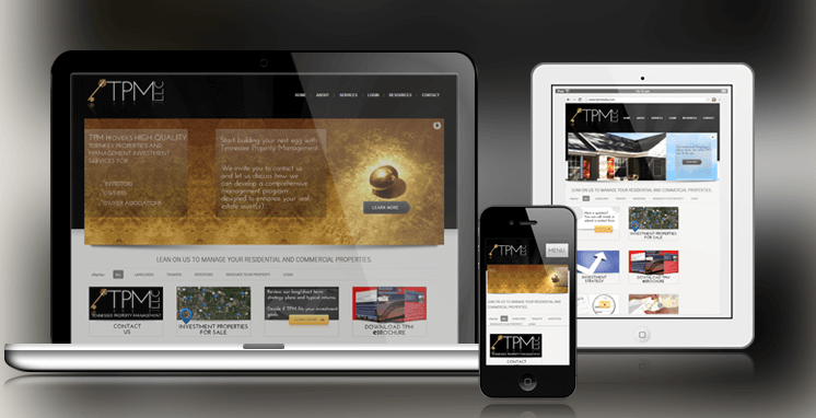
Instead of making separate sites for desktop and mobile, make one site that’s responsive to both. The design layout will shrink, stretch, and rearrange to fit the individual user’s screen dimensions and ensure a fluid experience for everyone. In addition to having a site that’s simpler to navigate and easier to read, future changes are more cost effective to implement since there’s only one site to work on!
If you’re ready to future proof your website,
GET RESPONSIVE